Table of Contents
Imagine a stranger knocking on your front door. They are dressed neatly, but they refuse to make eye contact. They offer to fix your roof, but when you ask for a business card, they hesitate. They claim to be “the best,” but they won’t tell you their last name or where their office is located.
Would you let them in? Probably not.
Yet, this is exactly what thousands of service business websites ask customers to do every day.
In the digital age, your website is that stranger on the digital doorstep. For service businesses—contractors, law firms, medical providers—the stakes are incredibly high. Unlike buying a $20 t-shirt online, hiring a service provider often involves inviting someone into your home or entrusting them with sensitive personal data. This creates a psychological “Trust Gap.”
At Lithium Marketing, we operate differently. We believe that a beautiful website is worthless if it doesn’t convert. While many agencies focus strictly on aesthetics, we focus on the psychology of conversion and the ROI of your digital presence. The reality is that your glossy design might actually be triggering alarm bells in your customers’ minds.
Here is the science behind why visitors leave and the five essential trust signals you need to close the gap.
1. The Neuroscience of “Stranger Danger”
You do not have the luxury of time when it comes to winning over a new visitor. In fact, human beings are evolutionarily hardwired to assess threats instantly.
According to research from the Missouri University of Science and Technology, it takes users less than two-tenths of a second to form a first impression of your website. Within 2.6 seconds, their eyes have already concentrated on specific areas to reinforce that impression.
This rapid judgment is what Nobel laureate Daniel Kahneman calls “System 1” thinking—it is fast, automatic, and emotional. If your web design fails this initial “blink test,” the user’s logical brain never even gets a chance to read your service menu. They simply bounce.
The Stanford Persuasive Technology Lab calls this the “Prominence-Interpretation Theory.” Users notice a design element (Prominence) and immediately assign value to it (Interpretation). If the design looks cluttered or broken, the user subconsciously interprets the business as “incompetent” or “unsafe.”
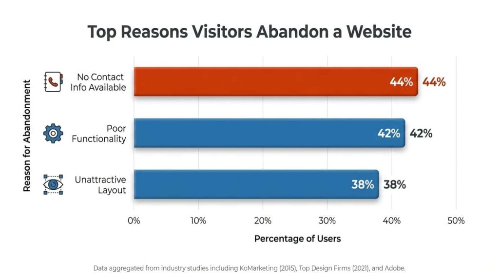
As the data from GoodFirms shows, poor functionality (42%) and unattractive layouts (38%) are top reasons for abandonment. Furthermore, research from KoMarketing highlights that 44% of users will leave simply because contact info is missing. If the brain perceives difficulty or confusion—known as low cognitive fluency—it equates that difficulty with risk.
2. Signal 1: Verification & Security
If you are a plumber, an electrician, or a financial advisor, you are asking for a high level of trust. Vague claims of quality are no longer enough. To bridge the Trust Gap, you must provide verification.
The most basic form of verification is contact information. It sounds simple, yet a surprising number of businesses hide their phone numbers or physical addresses. Data reveals that over half of visitors view thorough contact information as the most critical element missing from company websites.
In the service industry, the fear of “scams” is a primary barrier to conversion. Displaying your license numbers (e.g., “State License #987654”) and insurance badges serves as a “trust anchor.” It proves you operate legally and ethically.
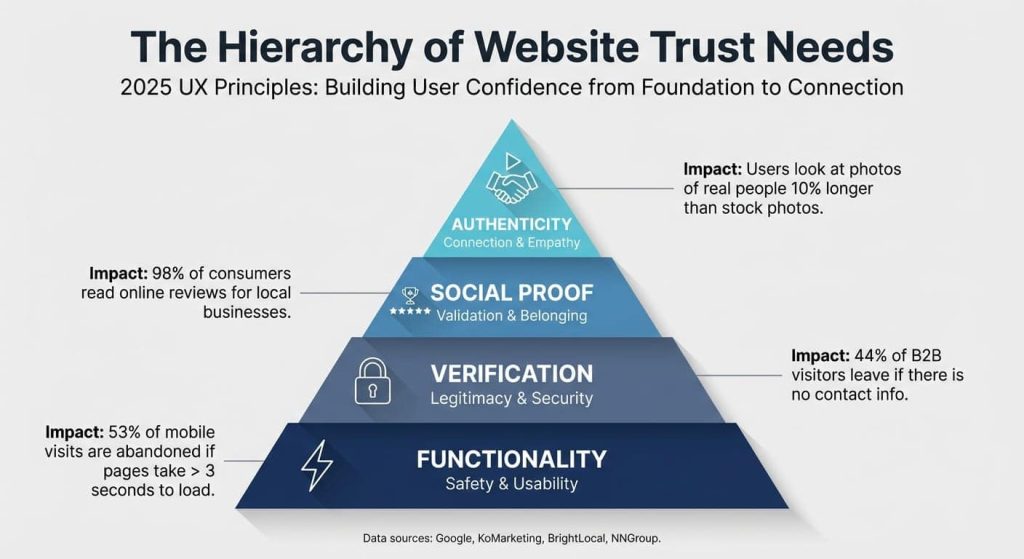
Think of trust as a hierarchy, as illustrated above. You must satisfy the base layers—Functionality (speed, mobile responsiveness) and Verification (licenses, security badges)—before a user will ever care about your “Authenticity” or “Social Proof.” If your site doesn’t load or lacks a physical address, no amount of 5-star reviews will save the sale.
3. Signal 2: Visual Authenticity (The “Uncanny Valley” of Stock Photos)
Nothing screams “fake” quite like a pristine stock photo of models in generic suits shaking hands in a glass office.
Psychologists refer to this as the “uncanny valley”—images that look human but feel artificial, causing a sense of unease. In web design, this leads to a phenomenon known as “Banner Blindness.” Eye-tracking studies by the Nielsen Norman Group show that users completely ignore generic stock photos. They treat them as decoration, not content.
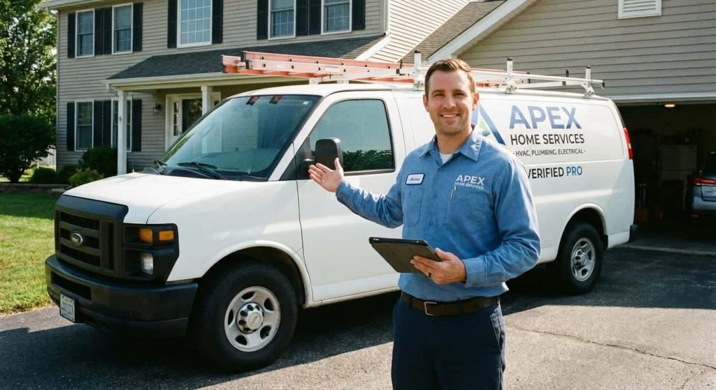
However, when you replace those stock images with real photos of your team, your trucks, or your actual work, the behavior changes dramatically. Real faces are treated as critical content. They are scrutinized for cues on culture, safety, and professionalism.
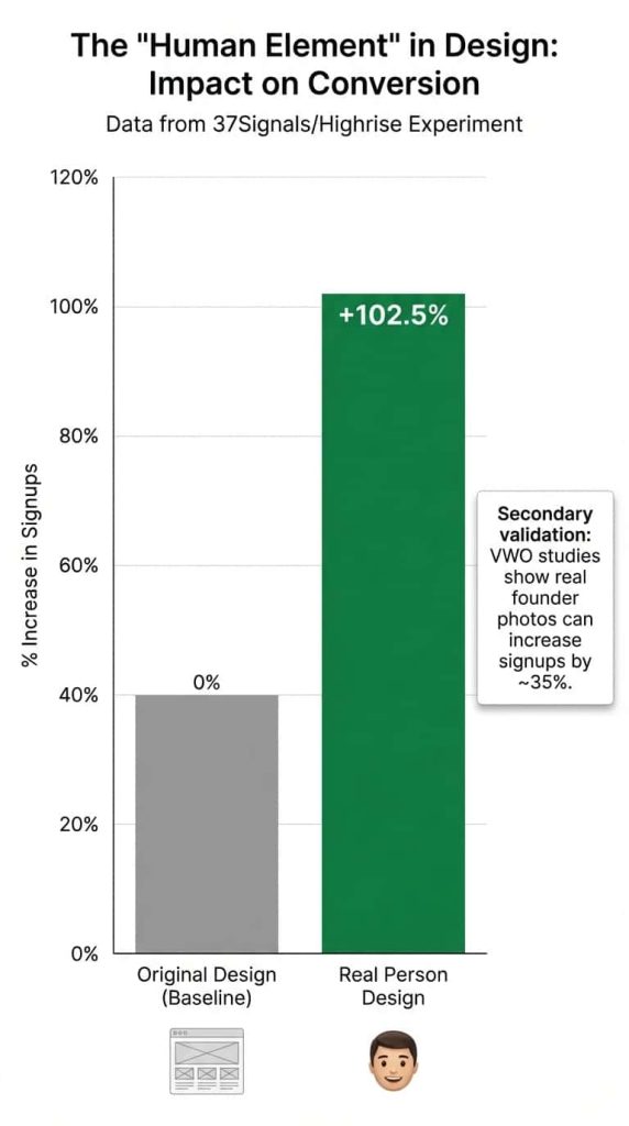
In a famous A/B test by 37Signals (creators of Highrise), replacing a generic design with a photo of a real person increased signups by a massive 102.5%. Similarly, VWO found that using a real founder’s photo increased conversion by 35%.
4. Signal 3: Third-Party Validation
You can say you’re the best, but it means infinitely more when someone else says it. Social proof is the digital equivalent of word-of-mouth. According to BrightLocal, 98% of consumers read online reviews for local businesses. However, consumers have become sophisticated; they can spot “curated” perfection from a mile away.
This leads to the “Perfect Score Paradox.” Research from Northwestern University suggests that a perfect 5.0 rating is often perceived as less trustworthy than a 4.2 to 4.5 rating. Why? Because a perfect score looks censored or fake.
Trust is not built by hiding negative feedback. It is built by how you respond to it.
- Embed Live Reviews: Don’t just copy and paste text onto a “Testimonials” page (users assume these are fabricated). Use widgets from Google or Trustpilot to stream live feedback.
- Show Volume: A 4.8 rating with 200 reviews is more powerful than a 5.0 rating with 2 reviews.
5. Signal 4: Risk Reversal and Guarantees
Service businesses often ask for high-ticket commitments. A homeowner might be spending $15,000 on a new roof; a client might be paying a $5,000 retainer for legal aid. This triggers “Loss Aversion”—the psychological reality that the fear of losing money outweighs the joy of gaining value.
To convert these visitors, you must reverse the risk.
- Weak Guarantee: “Satisfaction Guaranteed.” (This is vague and meaningless).
- Strong Risk Reversal: “Don’t pay a dime until the job is done,” or “5-Year Workmanship Warranty.”
This shifts the risk from the buyer to you, the seller, and signals immense confidence in your service.
Comparative Analysis: Aesthetic-First vs. Trust-First Design
At Lithium Marketing, we often audit websites that look “pretty” but perform poorly. Here is the difference between a graphic design approach and a Trust-First approach focused on SEO and conversion.
| Feature | Aesthetic-First Approach (Low Conversion) | Trust-First Approach (High Conversion) |
|---|---|---|
| Imagery | High-polish stock photos of models or generic sites. | Candid, high-quality photos of the actual team and branded vehicles. |
| Credentials | Buried in the footer or missing to keep the design “clean.” | License numbers and insurance badges prominent in the header. |
| Copywriting | Vague superlatives (“We are the best”). | Specific claims backed by data (“Voted Best in City 2024”). |
| Call to Action | Generic labels: “Submit” or “Contact.” | Benefit-driven: “Get My Free Quote” or “Secure Appointment.” |
| Social Proof | A static “Testimonials” page with text-only quotes. | Live review widgets integrated near every button. |
Final Thoughts
In 2024, trust is the most valuable currency in the service industry. With the rise of AI and increasing consumer skepticism, your website needs to do more than just look good—it needs to make your customers feel safe.
If your website isn’t generating the leads you expect, it might not be a traffic problem. It might be a trust problem.
Is your digital handshake firm and confident, or is it scaring customers away?
Ready to turn your website into a trust-building asset?
Contact Lithium Marketing today for a comprehensive audit of your digital presence.
References
- Missouri University of Science and Technology: First Impressions Form Quickly on the Web
- Stanford Persuasive Technology Lab: Guidelines for Web Credibility
- Psychological Science: If It’s Hard to Read, It’s Hard to Do
- KoMarketing: B2B Web Usability Report
- Nielsen Norman Group: Photos as Web Content
- VWO: Real Human Photos vs. Stock Images Case Study
- BrightLocal: Local Consumer Review Survey 2024
- PowerReviews & Northwestern University: The Impact of Reviews on Conversion Rates
- Baymard Institute: How Users Perceive Security During Checkout
- CXL Institute: Trust and Credibility in Web Design
- Edelman: 2024 Trust Barometer
- Google: Search Quality Evaluator Guidelines
- GoodFirms: Web Design Survey & Reasons for Leaving a Website
- Marcus Sheridan: The River Pools and Spas Story
- Signal v. Noise: Highrise A/B Testing Behind the Scenes